Building an Interactive Data Exploration App with R Shiny

Introduction

In this tutorial, we will walk through the creation of an interactive data exploration application using R Shiny. This app allows users to filter data, view various charts, and download them for further analysis.

Prerequisites

  • Basic understanding of R programming
  • R and RStudio installed
  • Shiny, ggplot2, and DT packages installed

App Overview

Our R Shiny app includes:

  • A filterable table
  • Interactive charts including bar plots, scatter plots, and line plots
  • Data download functionality

Getting Started

First, ensure you have the required libraries:

library(shiny)
library(DT)
library(ggplot2)

Data Preparation

Load and preprocess your data. In our case, we are reading from a CSV file and creating bins for age and income:

dataset = read.csv("dataset.csv")
# Create bins for age and income
dataset$AGE_Bin = cut(dataset$AGE,5,include.lowest = TRUE)
dataset$INCOME_Bin = cut(dataset$INCOME,5,include.lowest = TRUE,dig.lab = 6)

The code contains the UI and Server in two parts. I will layout the complete code of each part here, and later in the article, I will delve into the very intuitive UI design in Shiny.

Building the UI

The user interface (UI) is designed with fluidPage for a responsive layout.

ui <-   fluidPage(
    
    h1("Rshiny Homework"),
    h2("Demographic Exploartion"),
    h3("Filterable Table"),
    DT::dataTableOutput("table"),
    br(),
    h3("Charts"),
    selectInput(
        "option",
        "Demography",
        c("AGE_Bin","INCOME_Bin","GENDER"),
        selected = NULL,
        multiple = FALSE,
        selectize = TRUE,
        width = NULL,
        size = NULL
    ),
    
    actionButton("gobutton", "View Chart", class = "btn-success"),
    plotOutput("disPlot"),
    downloadButton(outputId = "disPlot_download", label = "Download Chart",class = "btn-success"),
    
    br(),
    hr(),
    br(),
    h3("Relationship Between Variables"),
    
    tabsetPanel(
        tabPanel("Scatter", 
                 plotOutput("Scatter", brush="selected_range"),
                 br(),
                 downloadButton(outputId = "scatter_download", label = "Download Chart",class = "btn-success"),
                 br(),
                 br(),
                 DT::dataTableOutput("brushed_table")
        ),
        tabPanel("Distribution", 
                 plotOutput("displot2"),
                 downloadButton(outputId = "displot2_download", label = "Download Chart",class = "btn-success"),
                 br(),
                 plotOutput("displot3"),
                 downloadButton(outputId = "displot3_download", label = "Download Chart",class = "btn-success")
                 
        )
    ),
    
    br(),
    hr(),
    br(),
    h3("Line Plot"),
    plotOutput("lineplot"),
    downloadButton(outputId = "lineplot_download", label = "Download Chart",class = "btn-success"),
    br(),
    plotOutput("lineplot2"),
    downloadButton(outputId = "lineplot2_download", label = "Download Chart",class = "btn-success")
)

Server Logic

The server function contains the logic for rendering plots and tables based on user input. As you may find, all backend data handling and visual design goes in here.

server <- function(input,output, session) {
    
    library(ggplot2)
    library(shiny)
    library(DT)
    # library(stringr)
    
    #setwd("C:/Users/kli4/Downloads/Shiny_HW")
    
    dataset = read.csv("dataset.csv")
    dataset$AGE_Bin = cut(dataset$AGE,5,include.lowest = TRUE)
    dataset$INCOME_Bin = cut(dataset$INCOME,5,include.lowest = TRUE,dig.lab = 6)
    # dataset$INCOME_Bin <- lapply(strsplit(gsub("]|[[(]", "", levels(dataset$INCOME_Bin)), ","),
    #           prettyNum, big.mark=".", decimal.mark=",", input.d.mark=".", preserve.width="individual")
    
    
    plot_var <- eventReactive(input$gobutton,{
        
        selection <- input$option
        
        data_agg <-aggregate(x=dataset$Customer, by=list(SELECTION=dataset[,c(selection)],TREATMENT = dataset[,"TREATMENT"]),length)
        names(data_agg) = c("SELECTION","TREATMENT", "Customer")
        
        return(data_agg)
        
    })
    
    
    output$disPlot <- renderPlot({
        displot = ggplot(plot_var(), aes(x=SELECTION,y=Customer,fill=TREATMENT)) + geom_bar(position="stack",stat="identity")
        
        output$disPlot_download <- downloadHandler(
            filename = function() { paste(input$option, '.jpg', sep='') },
            content = function(file){
                ggsave(file,plot=displot)
            })
        displot
    })
    

    output$table <- DT::renderDataTable(datatable(dataset))
 
    scatter_plot <- ggplot(dataset, aes(x=AGE,y=INCOME)) + geom_point()
    
    scatter_plot = scatter_plot + facet_grid(GENDER ~ TREATMENT)
    
    output$Scatter <- renderPlot({
        scatter_plot
    })
    
    scatter_brushed <- reactive({
        
        my_brush <- input$selected_range
        sel_range <- brushedPoints(dataset, my_brush)
        return(sel_range)
        
    })
    output$brushed_table <- DT::renderDataTable(DT::datatable(scatter_brushed()))


    displot2 <- ggplot(dataset, aes(online.Activity.A)) + geom_histogram(aes(fill=AGE_Bin), bins = 5)
    
    displot2 = displot2 + facet_grid(GENDER ~ TREATMENT)
    
    displot3 <- ggplot(dataset, aes(online.ACTIVITY.B)) + geom_histogram(aes(fill=AGE_Bin), bins = 5)
    
    displot3 = displot3 + facet_grid(GENDER ~ TREATMENT)
    
    output$displot2 <- renderPlot({
        displot2
    })
    
    output$displot3 <- renderPlot({
        displot3
    })
    # 
    # scatter_brushed2 <- reactive({
    #   
    #   my_brush <- input$selected_range2
    #   sel_range <- brushedPoints(dataset, my_brush)
    #   return(sel_range)
    #   
    # })
    # output$brushed_table2 <- DT::renderDataTable(DT::datatable(scatter_brushed2()))
    
    data_agg2 <-aggregate(list(Activity_A=dataset$online.Activity.A), by=list(DAY=dataset$DAY,TREATMENT=dataset$TREATMENT,GENDER=dataset$GENDER),mean)
    
    lineplot <- ggplot(data_agg2, aes(x=DAY, y=Activity_A, group=c(TREATMENT))) + geom_line(aes(color=TREATMENT)) + geom_point()
    lineplot = lineplot + facet_grid(GENDER ~ TREATMENT)
    
    output$lineplot <- renderPlot({
        lineplot
    })
    
    data_agg2 <-aggregate(list(Activity_B=dataset$online.ACTIVITY.B), by=list(DAY=dataset$DAY,TREATMENT=dataset$TREATMENT, GENDER=dataset$GENDER),mean)
    
    lineplot2 <- ggplot(data_agg2, aes(x=DAY, y=Activity_B, group=c(TREATMENT))) + geom_line(aes(color=TREATMENT)) + geom_point()
    lineplot2 = lineplot2 + facet_grid(GENDER ~ TREATMENT)
    
    output$lineplot2 <- renderPlot({
        lineplot2
    })
    
    #Downloads
    
    output$lineplot2_download <- downloadHandler(
        filename = "Activity_B Line.jpg",
        content = function(file){
            ggsave(file,plot=lineplot2)
        })
    
    output$lineplot_download <- downloadHandler(
        filename = "Activity_A Line.jpg",
        content = function(file){
            ggsave(file,plot=lineplot)
        })
    
    output$displot2_download <- downloadHandler(
        filename = "ActivityA_Dist.jpg",
        content = function(file){
            ggsave(file,plot=displot2)
        })
    output$displot3_download <- downloadHandler(
        filename = "ActivityB_Dist.jpg",
        content = function(file){
            ggsave(file,plot=displot3)
        })
    
    output$scatter_download <- downloadHandler(
        filename = "Age_Income.jpg",
        content = function(file){
            ggsave(file,plot=scatter_plot)
        })
    

}

UI Design in R Shiny

UI design in R Shiny is easy and intuitive. It’s an HTML element as a function concept. Let’s dive into how UI is designed in our R Shiny app, using the provided code as an example.

Basic Structure

R Shiny UI is structured using functions defining the layout and its elements. The fluidPage() function is often used for its responsive layout capabilities, meaning the app’s interface adjusts nicely to different screen sizes.

ui <- fluidPage(
    # UI components are nested here
)

Organizing Content with Headers and Separators

Headers (h1, h2, h3, etc.) and separators (hr()) are used to organize content and improve readability. In our app, headers indicate different sections:

h1("Rshiny Homework"),
h2("Demographic Exploration"),
h3("Filterable Table"),

Data Display

The DT::dataTableOutput() function is used to render data tables in the UI. This function takes an output ID as an argument, linking it to the server logic that provides the data:

DT::dataTableOutput("table"),

Interactive Inputs

Interactive inputs, such as selectInput, allowing users to interact with the app and control what data or plot is displayed. In our app, selectInput is used for choosing demographic aspects to display in a chart:

selectInput(
    "option",
    "Demography",
    c("AGE_Bin", "INCOME_Bin", "GENDER"),
    selected = NULL,
    multiple = FALSE,
    selectize = TRUE,
    width = NULL,
    size = NULL
),

Action Buttons

Action buttons, created with actionButton(), trigger reactive events in the server. Our app uses an action button to generate plots based on user selection:

actionButton("gobutton", "View Chart", class = "btn-success"),

Displaying Plots

To display plots, plotOutput() is used. This function references an output ID from the server side where the plot is rendered:

plotOutput("disPlot"),

Interactive Plots

I use ggplot2 for creating interactive plots. For example, a scatter plot is generated based on user-selected variables:

scatter_plot <- ggplot(dataset, aes(x=AGE,y=INCOME)) + geom_point()

Tabbed Panels

Tabbed panels, created with tabsetPanel(), help in organizing content into separate views within the same space. Each tabPanel holds different content:

tabsetPanel(
    tabPanel("Scatter", ...),
    tabPanel("Distribution", ...)
),

Download Handlers

We provide functionality for users to download plots as JPEG files:

output$scatter_download <- downloadHandler(
    filename = "Age_Income.jpg",
    content = function(file){
        ggsave(file,plot=scatter_plot)
    })

downloadButton(outputId = "scatter_download", label = "Download Chart", class = "btn-success"),

Running the App

Finally, to run the app, use:

shinyApp(ui = ui, server = server)

Airflow Systemd Config File

Need to pay attention to environment path, user.

[Unit]
Description=Airflow webserver daemon
After=network.target postgresql.service mysql.service redis.service rabbitmq-server.service
Wants=postgresql.service mysql.service redis.service rabbitmq-server.service

[Service]
#EnvironmentFile=/etc/sysconfig/airflow
Environment=PATH=$PATH:/home/ken/miniconda3/bin/
User=ken
Group=ken
Type=simple
ExecStart=/home/ken/miniconda3/bin/airflow webserver
Restart=on-failure
RestartSec=5s
PrivateTmp=true

[Install]
WantedBy=multi-user.target

How to Correctly Install CuDF for Python

Introduction of CuDF

CuDF is a powerful tool in the era of big data. It utilizes GPU computing framework Cuda to speed up data ETL and offers a Pandas-like interface. The tool is developed by the team, RapidAI

You can check out their Git repo here.

I love the tool. It gives me a way to make full use of my expensive graphic card, which most of the time only used for gaming. Most importantly, for a company like Owler, which has to handle 14 millions+ company profiles, even a basic data transformation task might take days. This tool is possible to help speed up the process by about 80+ times. GPU computing has been a norm for ML/AL. CuDF makes it also good for the upper stream of the flow, the ETL. And ETL is in high demand for almost every company with digital capacity in the world.

The Challenges

It’s nice to have this tool for our day-to-day data work. However, the convenience comes at a cost. That is, the installation of CuDF is quite confusing and hard to follow. It also has some limitations in OS and Python versions. Currently, it only works with Linux and Python 3.7+. And it only provides a condo-forge way to install; otherwise, you need to build from the source.

The errors range from solving environment fail, dependencies conflict, inability to find GPU, and such. I have been installing CuDF into a couple of servers, including personal desktop, AWS, and so on. Each time, I have to spend hours dealing with multiple kinds of errors and try them again and again. When it finally works, I don’t know which one is the critical step because there were so many variables. Most ugly, when you have dependency conflict error, you have to wait for a very long time after 4 solving environment attempts until it displays the conflicting package for you.

But the good news is, from the most recent installation, I can finally understand the cause for the complication and summarize an easy to follow guide for anyone who wants to enjoy this tool.

In short, the key is, use miniconda or create a new environment in anaconda to install.

Let me walk through the steps.

Installing the Nvidia Cuda framework (Ubuntu)

Installing Cuda is simple when you have the right machine. You can follow the guide here from Nvidia official webpage. If you encounter an installation error, please check if you are selecting the right architecture and meet the hardware/driver requirements.

However, if you have an older version of Cuda installed and wish to upgrade that. The Nvidia guide won’t help you anyway. The correct way is to uninstall the older version Cuda first before doing anything from the guide. The reason is that, at least in Ubuntu, the installation step will change your apt-get source library; once you do that, you will no longer be able to uninstall the older version, and it may cause conflict.

To uninstall Cuda, you can try the following steps. (for Ubuntu)

  • Remove nvidia-cuda-toolkit
sudo apt-get remove nvidia-cuda-toolkit

You may want to use this command instead to remove all the dependencies as well.

sudo apt-get remove --auto-remove nvidia-cuda-toolkit
  • Remove Cuda
sudo apt-get remove cuda

If you forgot to remove the older version cuda before installing the new version, you would need to remove all dependencies for cuda and start over the new version installation.

sudo apt-get remove --auto-remove cuda
  • Install cuda by following the Nvidia official guide. Link above.

Install CuDF

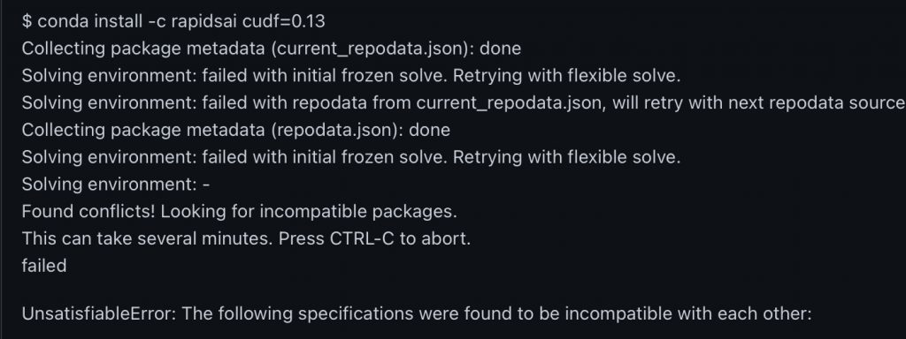
I highly recommend installing CuDF in miniconda. This will avoid most of the package dependency conflicts. If you have dependency conflicts, you will probably get the below error. Or you will be waiting forever during the last solving environment step.

Dependencies error

Miniconda is a much cleaner version of Anaconda. It has very few packages installed out of box. So it will avoid the CuDF installation running into conflict.

If you already have Anaconda installed and wish to keep it. You can try creating a new condo environment with no default package for CuDF.

conda create --no-default-packages -n myenv python=3.7

Building Sales Prediction Models

In this work sample, I demonstrated how to build a predictive model for sales data using Python with Sklearn, Statsmodels, and other libraries. The sample includes using linear regression model and time series model.
Homework - Modeling (2)

Reef Tank Lesson

While removing fish tank cover will significantly help reduce the heat/temp, water will vapor much quicker. To avoid salinity going too high, keep the salinity below 1.025 (the upper limit of the proper range).

Saltwater tank rarely has low oxygen condition. If you see fist breathing hard, it’s likely a bacteria spike, especially coming with cloudly water.

Removing Fish Tank Cover

There’s a reason to remove fish tank cover. It’s to increase water vaporization so that the water temperature can be lower during summertime.

Beginner’s Guide to Care A Fish Tank

Beginner’s Guide to Care A Fish Tank

(not to start a new one)

 CaresImportant Notes
DailyObserve the fish’s activities and see if they are active and craving for food. If not, do an emergency check. Feed a little bit of food that can be consumed in 3 mins (literally just a little bit 3 – 5 pieces or 1/5 of a spoon) 
WeeklyFill the tank with drink water (not hot, not cold) up to the original levelWater change guideline:Water is the key to fishes; test the temp with your figure and make sure you don’t feel hot or cold before add water; this is to ensure that the water temp is similar to tank water, so the fishes won’t be shocked by changing temp
Every other weekChange 1/3 of the tank water. Use the water to water plants (it’s rich in the nutrient) Look at the back filter and see if it needs to be cleanedAdd water slowly and prevent currentYou can use the tank lid to help soften the water flow. Use drinking water to clean the filter material
[emergency check]Fishes become less active or sickObserve the fin and tail and body of the fish and see if there’s any holds, rot, or any imperfection, if so use: this. If you find no sign of those or some white dots on fish body, use this. Fish getting sick usually means they feel stress in water, so we need to do a series of water changes: change half of the water every other day for at least a week according to the water change guideline. You can dose this magic beneficial bacterial every time you change the waterThere’re generally two kinds of fish diseases, bacterial or parasitic. Use the right treatment. Be extra care in selecting the right treatment. Usually, if you observe some strange dot or color on the skin, use bacterial treatment first. If you see fish behave strangely, use parasitic treatment. In such a case, don’t use bacterial treatment as it may kill the fish. During the treatment, also raise the temperature to 85 F
Adding fishes Only buy fish from a clean tank, if you observe some fish seems sick in the tank, don’t buy from that. If you have this, dose less than 1 ml in the bag before acclimating the fish.

To acclimate the fish: Pour excessive water out of the bag, but make sure fish have room to moveFloat the bag in the water. While floating, add a small amount of water every 10 mins After adding more than half of the bag water and at least 1 hour, use a net to add the fish to the tank. Don’t add the bag water to the tank (prevent diseases)
If you don’t have an quarantine tank, rotating two treatments can prevent illness when adding fish but need to make sure no fish have a parasitic illness and should dose 12 hrs apart.

Run Regression in Python with Statsmodel Package

Run Regression
In [9]:
from statsmodels import api as sm
from my_libs import *

Regress the SPY and VIX index

  • Need to translate the result into np.array
  • Need to change type to float
In [51]:
spy = get_price_data(["SPY"],method='day',back_day=20).dropna().Return.values.astype(float)
spy_ = spy*30
All price data of Close is actually Adj Close
Connection Successful
Finished SPY

Constructed a model of vix = intercept + b0 * spy + b1 * spy * 30

In [52]:
ip = pd.DataFrame({"spy":spy,"spy_":spy_})
dp = get_price_data(["^VIX"],method='day',back_day=20).dropna().Return.values.astype(float)
All price data of Close is actually Adj Close
Connection Successful
no data for ^VIX
'NoneType' object has no attribute 'index'
switching to realtimeday method
Finished ^VIX
In [53]:
ip = sm.add_constant(ip)
/home/ken/.local/lib/python2.7/site-packages/numpy/core/fromnumeric.py:2389: FutureWarning: Method .ptp is deprecated and will be removed in a future version. Use numpy.ptp instead.
  return ptp(axis=axis, out=out, **kwargs)
In [54]:
sm.OLS(dp,ip).fit().summary()
/home/ken/.local/lib/python2.7/site-packages/scipy/stats/stats.py:1416: UserWarning: kurtosistest only valid for n>=20 ... continuing anyway, n=13
  "anyway, n=%i" % int(n))
Out[54]:
OLS Regression Results
Dep. Variable: y R-squared: 0.737
Model: OLS Adj. R-squared: 0.713
Method: Least Squares F-statistic: 30.80
Date: Sun, 04 Aug 2019 Prob (F-statistic): 0.000173
Time: 19:40:53 Log-Likelihood: 25.241
No. Observations: 13 AIC: -46.48
Df Residuals: 11 BIC: -45.35
Df Model: 1
Covariance Type: nonrobust
coef std err t P>|t| [0.025 0.975]
const 0.0033 0.011 0.305 0.766 -0.021 0.027
spy -0.0109 0.002 -5.550 0.000 -0.015 -0.007
spy_ -0.3256 0.059 -5.550 0.000 -0.455 -0.196
Omnibus: 9.222 Durbin-Watson: 1.071
Prob(Omnibus): 0.010 Jarque-Bera (JB): 4.912
Skew: -1.262 Prob(JB): 0.0858
Kurtosis: 4.641 Cond. No. 5.85e+17


Warnings:
[1] Standard Errors assume that the covariance matrix of the errors is correctly specified.
[2] The smallest eigenvalue is 3.82e-35. This might indicate that there are
strong multicollinearity problems or that the design matrix is singular.

Linear Discriminant Analysis (LDA)

A scoring model is a family of statistical tools developed from qualitative and quantitative empirical data that determines the appropriate parameters and variables for predicting default. Linear discriminant analysis (LDA) is one of the most popular statistical methods used for developing scoring models. An LDA-based model is a reduced form model due to its dependency on exogenous variable selection, the default composition, and the default definition. A scoring function is a linear function of variables produced by an LDA. The variables are chosen based on their estimated contribution to the likelihood of default and come from an extensive pool of qualitative features and accounting ratios. The contributions (i.e., weights) of each accounting ratio to the overall score are represented by Altmans Z-score. Although there are many discriminant analysis methods, the one referenced in this topic is the ordinary least squares method.

LDA categorizes firms into two groups: the first represents performing (solvent) firms and the second represents defaulting (insolvent) firms. One of the challenges of this categorization is whether or not it is possible to predict which firms will be solvent and which will be insolvent prior to default. A Z-score is assigned to each firm at some point prior to default on the basis of both financial and nonfinancial information. A Z cut-off point is used to differentiate both groups, although it is imperfect as both solvent and insolvent firms may have similar scores. This may lead to incorrect classifications.

Altman proposed the following LDA model:
[latex]Z = 1.21x_1 +1.40x_2 + 3.30x_3 + 0.6x_4 + 0.999x_5[/latex]

where:

[latex]x_1[/latex] = working capital / total assets

[latex]x_2[/latex] = accrued capital reserves / total assets

[latex]x_3[/latex] = EBIT / total assets

[latex]x_4[/latex] = equity market value / face value of term debt

[latex]x_5[/latex] = sales / total assets

In this model, the higher the Z-score, the more likely it is that a firm will be classified in the group of solvent firms. The Z-score cut-off (also known as the discriminant threshold) was set at Z = 2.673. The model was used not only to plug in current values to determine a Z-score, but also to perform stress tests to show what would happen to each component (and its associated weighting) if a financial factor changed.

Another example of LDA is the RiskCalc model, which was developed by Moodys. It incorporates variables that span several areas, such as financial leverage, growth, liquidity, debt coverage, profitability, size, and assets. The model is tailored to individual countries, with the model for a country like Italy driven by the positive impact on credit quality of factors such as higher profitability, higher liquidity, lower financial leverage, strong activity ratios, high growth, and larger company sizes.

With LDA, one of the main goals is to optimize variable coefficients such that Z-scores minimize the inevitable overlapping zone between solvent and insolvent firms. For two groups of borrowers with similar Z-scores, the overlapping zone is a risk area where firms may end up incorrectly classified, historical versions of LDA would sometimes consider a gray area allowing for three Z-score range interpretations to determine who would be granted funding: very safe borrowers, very risky borrowers, and the middle ground of borrowers that merited further investigation. In the current world, LDA incorporates the two additional objectives of measuring default probability and assigning ratings.

The process of fitting empirical data into a statistical model is called calibration. LDA calibration involves quantifying the probability of default by using statistical-based outputs of ratings systems and accounting for differences between the default rates of samples and the overall population. This process implies that more work is still needed, even after the scoring function is estimated and Z-scores are obtained, before the model can be used. In the case of the model being used simply to accept or reject credit applications, calibration simply involves adjusting the Z-score cut-off to account for differences between sample and population default rates. In the case of the model being used to categorize borrowers into different ratings classes (thereby assigning default probabilities to borrowers), calibration will include a cut-off adjustment and a potential rescaling of Z-score default quantifications.

Because of the relative infrequency of actual defaults, a more accurate model can be derived by attempting to create more balanced samples with relatively equal (in size) groups of both performing and defaulting firms. However, the risk of equaling the sample group sizes is that the model applied to a real population will tend to overpredict defaults. To protect against this risk, the results obtained from the sample must be calibrated. If the model is only used to classify potential borrowers into performing versus defaulting firms, calibration will only involve adjusting the Z cut-off using Bayes theorem to equate the frequency of defaulting borrowers per the model to the frequency in the actual population.

Prior probabilities represent the probability of default when there is no collected evidence on the borrower. Prior probabilities qinsojv and qsolv represent the prior probabilities of insolvency and solvency, respectively. One proposed solution is to adjust the cut-off point by the following relation:

[latex]  ln(\frac{q_solv}{q_insolv})[/latex]

If it is the case that the prior probabilities are equal (which would occur in a balanced sample), there is no adjustment needed to the cut-off point (i.e., relation is equal to 0). If the population is unbalanced, an adjustment is made by adding an amount from the relation just shown to the original cut-off quantity.

For example, assume a sample exists where the cut-off point is 1.00. Over the last 20 years, the average default rate is 3.73% (i.e., [latex]q_insolv[/latex] = 3.73%). This implies that qsolv is equal to 96.25%, and the relation will dictate that we must add [latex]ln(\frac{96.25%}{3.75%})[/latex] or 3.25 to the cut-off point (1.00 + 3.25 = 4.25).

The risk is the potential misclassification of borrowers leading to unfavorable decisions rejecting a borrower in spite of them being solvent or accepting a borrower that ends up defaulting. In the case of the first borrower, the cost of the error is an opportunity cost (C O STolv/insolv). In the case of the second borrower, the cost is the loss given default (COSTinsolv/soly). These costs are not equal, so the correct approach may be to adjust the cut-off point to account for these different costs by adjusting the relation equation as follows:

[latex] ln(\frac{q_solv \times COST_solv/insolv}{q_insolv \times COST_insolv/solv})[/latex]

Extending the earlier example, imagine the current assessment of loss given default is 50% and the opportunity cost is 20%. The cut-off score will require an adjustment of: [latex]ln\frac{96.25% \times 20%}{3.75% \times 50%} [/latex]= 2.33.

The cut-off point selection is very sensitive to factors such as overall credit portfolio profile, the market risk environment, market trends, funding costs, past performance/budgets, and customer segment competitive positions.

Note that LDA models typically offer only two decisions: accept or reject. Modern internal rating systems, which are based on the concept of default probability, require more options for decisions.

(Risk Model Discussion) Distinguish between the Structural and the Reduced-form Approaches

Distinguish between the structural approaches and the reduced-form approaches to predicting default.

The foundation of a structural approach (e.g., the Merton model) is the financial and economic theoretical assumptions that describe the overall path to default. Under this approach, building a model involves estimating the formal relationships that link the relevant variables of the model. In contrast, reduced form models (e.g., statistical and numerical approaches) arrive at a final solution using the set of variables that is most statistically suitable without factoring in the theoretical or conceptual causal relationships among variables.

A reduced form model will not make any ex ante assumptions about causal drivers for default (unlike structural models); specific firm characteristics are linked to default, using statistics to tie them to default data. As such, the default event itself represents a real-life event. The independent variables in these models are combined based on their estimated contribution to the final result and can change in terms of relevance depending on firm size, firm sector, and economic cycle stage.

A significant model risk in reduced form approaches results from a models dependency on the sample used to estimate it. To derive valid results, there must be a strong level of homogeneity between the sample and the population to which the model is applied.

Reduced form models used for credit risk can be classified into statistical and numerical- based categories. Statistical-based models use variables and relations that are selected and calibrated by statistical procedures. Numerical-based approaches use algorithms that connect actual defaults with observed variables. Both approaches can aggregate profiles, such as industry, sector, size, location, capitalization, and form of incorporation, into homogeneous top-down segment classifications. A bottom-up approach may also be used, which would classify variables based on case-by-case impacts. While numerical and statistical methods are primarily considered bottom-up approaches, experts-based approaches tend to be the most bottom up.